
Being a designer for On The Record, I frequently end up assessing various things by their graphic design and little else. I’ll avoid a movie if it has a generic poster, or I might judge an organization if they use AI or Canva presets. My design-based judgement also leaks into my music taste; there have been instances where I avoid an album if the cover isn’t appealing to me. On the other hand, an album with a fantastic cover will receive bonus points on my scoreboard. I have gathered a list of my 5 favorite album covers, judging them based on overall appeal as well as how well it fits with the music itself.
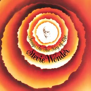
1: Songs In The Key Of Life – Stevie Wonder
This album isn’t called one of the greatest of all time because of it’s cover, but I cannot help but feel like this
cover represents how Stevie Wonder himself ‘sees’ music. The rippling circles feel like an interpretation of sound
waves. The warm colors used are classic, a staple of many Stevie Wonder album covers, and the 70s in general. Overall, this cover makes me feel like I am experiencing music the same way Stevie does: I can’t see it, but I sure can feel it.

2: DAMN. – Kendrick Lamar
This album is arguably the most type-biased one on the list.
Whenever I am designing something, I always try to make the text huge. Why would I make the message of my design small & insignificant when I could make it bold and big? That’s exactly why this cover works so well in my designer
head. A small touch I love is how the text just barely bleeds past the borders of the image, making it even more
imposing. While I think that there are many image ideas that Kendrick could have used instead of this one, I absolutely cannot imagine any other typography. It represents the weight of the story told in this album: A man having to decide
between wickedness or weakness.

3: I Know I’m Funny haha – Faye Webster
Flash photography has become a very popular style seen in many album covers in the 2020s, and to me, it can be
very hit or miss. If Faye decided to ship this album without the array of ‘haha’ stickers, it would be nowhere
near this list. By adding the stickers, Faye gave this album a personality: A melancholic, slow feeling that is accompanied with these stickers in an attempt to brighten the mood, but they (intentionally) do not work. The vinyl record also
comes with a set of the stickers, which is a nice bonus.
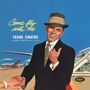
4: Come Fly With Me – Frank Sinatra
This style of art, ‘American Realism’ is a personal favorite of mine. It was common from the 30s to the 60s, a classic component of the vintage American pop culture aesthetic. The vibrant, blue sky perfectly contrasts with the yellow and white text. The aesthetic of luxurious travel is a personal favorite of mine (I almost put Call Me If You Get Lost by Tyler, The Creator on this list). In another life where I picked a career path that actually makes money, I would love to live a life like this.
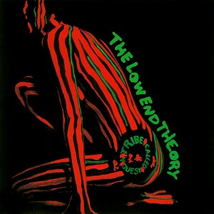
5: The Low End Theory – A Tribe Called Quest
In my opinion, A Tribe Called Quest’s album covers are some of the highest highs and the lowest lows I have ever
seen. Midnight Marauders, for example, is less than favorable for me. The Low End Theory, however, is just what I need. This red and green woman became an iconic symbol referenced on nearly every Tribe cover. I really just love the painting skills that went into drawing her, making a vivid figure with simple lines. It’s super impressive: every time I see this album, I interpret each line a little differently. The simple black background is great.


GARY ROUTT • Nov 22, 2025 at 5:17 pm
A great read, David! Touché!!!